Welcome to the WI Fast Stats app: Cotelydon!
WI Fast Stats is the open-source publicly available web app to analyze data from WI Fast Plants.
This web app is the accompanying tool for the WI Fast Plants webinar: Strategies for adapting WI Fast Plants selection of traits investigations for remote and social distance learning.
A video of the Data Analysis part can be found here.
File Display
Data Upload
Data in delimited text files can be separated by comma, tab or semicolon. For example, Excel data can be exported in .csv (comma separated) or .tab (tab separated) format
Warning: The maximum file size should not exceed 10MB
Click the checkbox if file has a header:
The sample data included here mimics the structure of a dataset the students will have after following the experiments described in the webinar. Each row corresponds to a plant, and we count the number of cotelydons. The generation column identifies if the plant is "parent" (p) or "offspring" (O). The parents column shows which were the parents of that plant. For example, 2x2 means that both parents had 2 cotelydons.
Plot Display
Data Visualization
Plot Option:
Mosaic plot: Plot to visualize contigency tables of frequencies among categorical variables
Data Visualization:
Please select the two variables to use in the plot and click on the button to generate the plot.
About colors: Click the FAQ tab in the left sidebar for more details on the color palettes
Violin Plot: Plot a numerical variable ("Quantity") by groups ("Group variable"). It is similar to the box plot but it also shows the distribution and spread of the data.
Data Visualization:
Please select the two variables to use in the plot and click on the button to generate the plot.
Add data points: This option allows the user to add a scatterplot of the data where each dot corresponds to one observation (row) in the dataset.
About colors: Click the FAQ tab in the left sidebar for more details on the color palettes
Box Plot: Plot a numerical variable ("Quantity") by groups ("Group variable"). Solid black line in the box represents the median, and the upper and lower edges of the box represent the 3rd and 1st quartiles respectively.
Data Visualization:
Please select the two variables to use in the plot and click on the button to generate the plot.
Add data points: This option allows the user to add a scatterplot of the data where each dot corresponds to one observation (row) in the dataset.
About colors: Click the FAQ tab in the left sidebar for more details on color palettes
Scatter Plot: Plot that shows the relationship between two numerical variables
Data Visualization:
Please select the two variables to use in the plot and click on the button to generate the plot.
About colors: Click the FAQ tab in the left sidebar for more details on the color palettes
Densities Plot: Plot that represents the distribution of a numeric variable (like a smoothed histogram)
Data Visualization:
Please select the two variables to use in the plot and click on the button to generate the plot.
About colors: Click the FAQ tab in the left sidebar for more details on the color palettes
Results Displayed
Data Analysis
Data Analysis Option:
Equal variance: The standard t test assumes equal variances on the two groups. If the user checks this option, the standard t test is run, but if the user unchecks this option, then the Welch t test is run instead (that does not assume equal variances).
T test: Statistical test of the null hypothesis of equality of means of a numerical variable ("Quantity") on two groups ("Group variable"). If the selected group variable has more than two categories, the user will select the two groups to compare.
How to interpret the result? If the p-value is less than 0.05, we reject the null hypothesis of equality of means. The confidence interval represents the interval for the difference of means.
Assumptions of t test: The t test assumes normality, equal variance and independence. Take a look at this link that illustrate how important normality and independence are in the t test results.
Chi-square test: Pearson's chi-square test is used to determine whether there is a statistically significant difference between the expected frequencies and the observed frequencies in one or more categories of a contingency table
How to interpret the result? If the p-value is less than 0.05, we reject the null hypothesis that in the population there is no difference between the classes (reject independence).
Frequently Asked Questions
Q: How to get help?
A: Check out the WI Fast Stats google user group where people post questions/answers. You can join to post questions: https://groups.google.com/g/wi-fast-stats
Q: Where can I find the information about the WI Fast Plants Webinar?
A: WI Fast Plants webinar: Strategies for adapting WI Fast Plants selection of traits investigations for remote and social distance learning.
Q: Where can I find the webinar slides for the Data science part?
A: The webinar slides are in the WI Fast Stats github repo here
Q: I found a bug or error in the code, how can I report it?
A: You should file an issue in the github repo: https://github.com/crsl4/fast-stats/issues
Q: How can I provide positive (or constructive) feedback?
A: Users feedback is very important to us! Please use this form
Q: If I use the website and web apps in my work, how do I cite them?
A: If you use the website or web apps in your work, we ask that you cite this paper
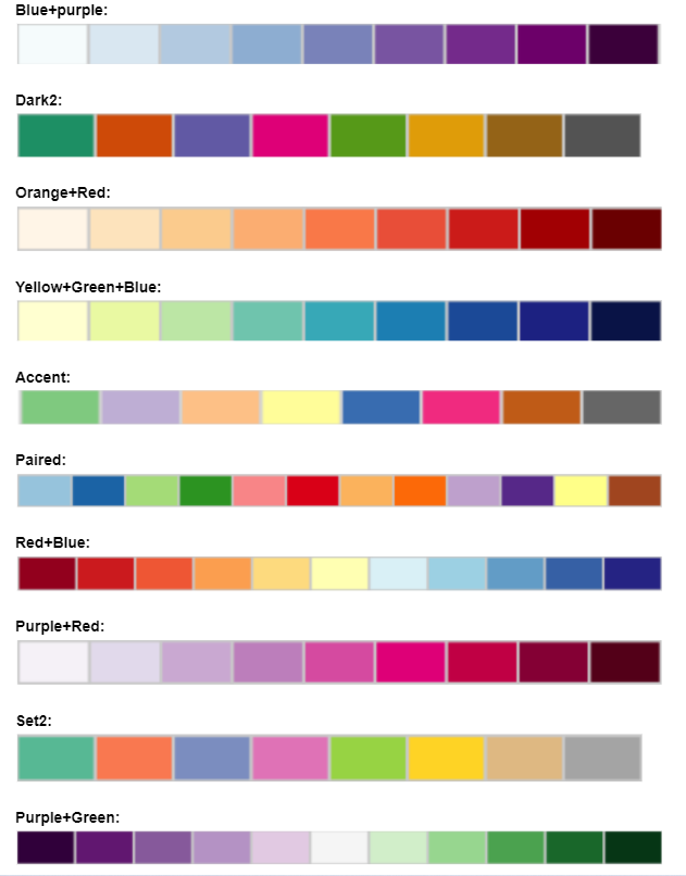
Q: Color Palettes Charts:
A: The colors palettes here shown come from ColorBrewer