Welcome to the WI Fast Stats app: Ecosystem!
WI Fast Stats is the open-source publicly available web app to analyze data from WI Fast Plants.
This web app is the accompanying tool for the WI Fast Plants webinar: Teaching Middle-level and Upper-elementary Students Ecosystem Concepts with Hands-on Fast Plants Investigations.
File Display
Data Upload
Data in delimited text files can be separated by comma, tab or semicolon. For example, Excel data can be exported in .csv (comma separated) or .tab (tab separated) format
Warning: The maximum file size should not exceed 10MB
Click the checkbox if file has a header:
The sample data included here mimics the structure of a dataset the students will have after following the experiments described in the webinar
Each row corresponds to a plant. The treatment column refers to dark (D) or light (L) and we measure different lengths: root, shoot and total
Plot Display
Data Visualization
Plot Option:
Data Visualization:
Please select the two variables to use in the plot and click on the button to generate the plot.
About colors: Click the FAQ tab in the left sidebar for more details on the color palettes
Mosaic plot: Plot to visualize contigency tables of frequencies among categorical variables
Violin Plot: Plot a numerical variable ("Quantity") by groups ("Group variable"). It is similar to the box plot but it also shows the distribution and spread of the data.
Data Visualization:
Please select the two variables to use in the plot and click on the button to generate the plot.
Add data points: This option allows the user to add a scatterplot of the data where each dot corresponds to one observation (row) in the dataset.
About colors: Click the FAQ tab in the left sidebar for more details on the color palettes
Box Plot: Plot a numerical variable ("Quantity") by groups ("Group variable"). Solid black line in the box represents the median, and the upper and lower edges of the box represent the 3rd and 1st quartiles respectively.
Data Visualization:
Please select the two variables to use in the plot and click on the button to generate the plot.
Add data points: This option allows the user to add a scatterplot of the data where each dot corresponds to one observation (row) in the dataset.
About colors: Click the FAQ tab in the left sidebar for more details on the color palettes
Scatter Plot: Plot that shows the relationship between two numerical variables
Data Visualization:
Please select the two variables to use in the plot and click on the button to generate the plot.
About colors: Click the FAQ tab in the left sidebar for more details on the color palettes
Frequently Asked Questions
Q: How to get help?
A: Check out the WI Fast Stats google user group where people post questions/answers. You can join to post questions: https://groups.google.com/g/wi-fast-stats
Q: Where can I find the information about the WI Fast Plants Webinar?
A: WI Fast Plants webinar: Teaching Middle-level and Upper-elementary Students Ecosystem Concepts with Hands-on Fast Plants Investigations.
Q: Where can I find the webinar slides for the Data science part?
A: The webinar slides are in the WI Fast Stats github repo here
Q: I found a bug or error in the code, how can I report it?
A: You should file an issue in the github repo: https://github.com/crsl4/fast-stats/issues
Q: How can I provide positive (or constructive) feedback?
A: Users feedback is very important to us! Please use this form
Q: If I use the website and web apps in my work, how do I cite them?
A: If you use the website or web apps in your work, we ask that you cite this paper
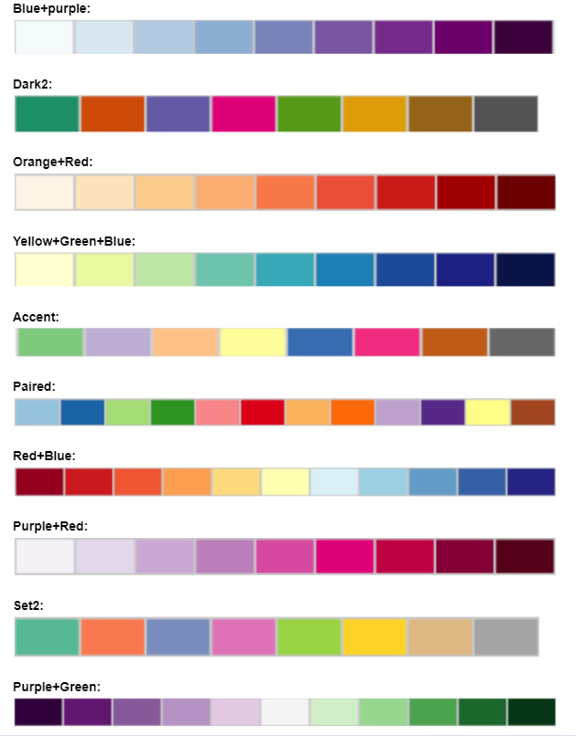
Q: Color Palettes Charts:
A: The colors palettes here shown come from ColorBrewer