Welcome to the WI Fast Stats web-app for IntroBio!
WI Fast Stats is the open-source publicly available web app to analyze data from WI Fast Plants.
This web app is the accompanying tool for the UW-Madison class: Introductory Biology 151/153-152.
A 9-minute tutorial of the WI Fast Stats web app can be found here.
For more information, a video of the Data Analysis part of a WI Fast Plants webinar can be found here.
File Display
Data Upload
Data in delimited text files can be separated by comma, tab or semicolon. For example, Excel data can be exported in .csv (comma separated) or .tab (tab separated) format. A template of the spreadsheet can be found here
Warning: The maximum file size should not exceed 10MB
Warning: The uploaded file must have a column named Experiment. A template of the spreadsheet can be found here
Click the checkbox if file has a header:
The sample data included here mimics the structure of a dataset the students will have after following the experiments in class. A template of the spreadsheet can be found here.
When the dataset contains information from multiple experiments, you can select which experiment you want to focus on for the plots. Important: The number of plants (rows) for the Experiment you have selected must be at least 15 for some of the plots to be displayed properly
Plot Display
Data Visualization
Plot Option:
Mosaic plot: Plot to visualize contigency tables of frequencies among categorical variables
Data Visualization:
Please select the two variables to use in the plot and click on the button to generate the plot.
About colors: Click the FAQ tab in the left sidebar for more details on the color palettes
Violin Plot: Plot a numerical variable ("Quantity") by groups ("Group variable"). It is similar to the box plot but it also shows the distribution and spread of the data.
Data Visualization:
Please select the two variables to use in the plot and click on the button to generate the plot.
Add data points: This option allows the user to add a scatterplot of the data where each dot corresponds to one observation (row) in the dataset.
About colors: Click the FAQ tab in the left sidebar for more details on the color palettes
Box Plot: Plot a numerical variable ("Quantity") by groups ("Group variable"). Solid black line in the box represents the median, and the upper and lower edges of the box represent the 3rd and 1st quartiles respectively.
Data Visualization:
Please select the two variables to use in the plot and click on the button to generate the plot.
Add data points: This option allows the user to add a scatterplot of the data where each dot corresponds to one observation (row) in the dataset.
About colors: Click the FAQ tab in the left sidebar for more details on color palettes
Scatter Plot: Plot that shows the relationship between two numerical variables
Data Visualization:
Please select the two variables to use in the plot and click on the button to generate the plot.
About colors: Click the FAQ tab in the left sidebar for more details on the color palettes
Densities Plot: Plot that represents the distribution of a numeric variable (like a smoothed histogram)
Data Visualization:
Please select the two variables to use in the plot and click on the button to generate the plot.
About colors: Click the FAQ tab in the left sidebar for more details on the color palettes
Results Displayed
Data Analysis
Statistical summary: We present a table with the number of plants (count), average (mean) and standard deviation (sd) for the selected plant phenotype (Quantity) by different treatments (Group Variable)
Linear model test: We test whether different treatments (Group Variable) have different values of a measured plant phenotype (Quantity) with a t test.
How to interpret the result? The group variable represents the different treatments in the experiment which is internally encoded as binary variables. For example, for the light experiment in the sample data, there are two treatments: light (L) and dark (D). In the coefficients table, there is an intercept which corresponds to the average estimated quantity (whatever plant phenotype chosen) for the dark treatment, and a Group_VariableL which corresponds to the difference in averages between the dark treatment and the light treatment. If this coefficient is close to zero, then we do not have evidence of different plant phenotypes on different treatments.
Frequently Asked Questions
Q: How to get help?
A: Check out the WI Fast Stats google user group where people post questions/answers. You can join to post questions: https://groups.google.com/g/wi-fast-stats
Q: Where can I find a short tutorial for this class web app?
A: A 9-minute tutorial of the WI Fast Stats web app can be found here
Q: Where can I find the WI Fast Plants webinar slides and video for the Data science part?
A: The webinar slides are in the WI Fast Stats github repo here and the video can be found here
Q: I found a bug or error in the code, how can I report it?
A: You should file an issue in the github repo: https://github.com/crsl4/fast-stats/issues
Q: How can I provide positive (or constructive) feedback?
A: Users feedback is very important to us! Please use this form
Q: If I use the website and web apps in my work, how do I cite them?
A: If you use the website or web apps in your work, we ask that you cite this paper
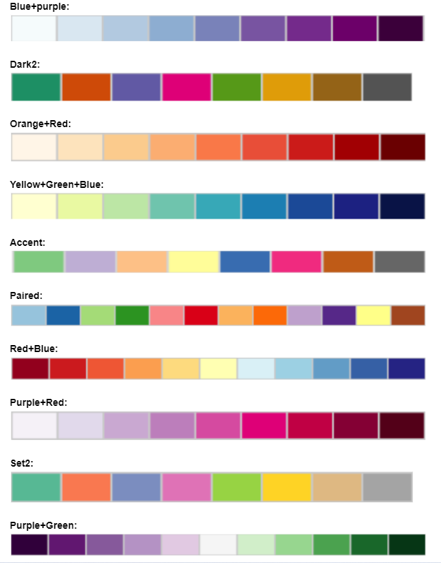
Q: Color Palettes Charts:
A: The colors palettes here shown come from ColorBrewer